
Does Changing a Button's Color Really Increase Sales?
Is the claim that red buttons raise conversion rates a myth? Discover the real contrast behind HubSpot’s famous A/B test and a guide to choosing your CTA color.
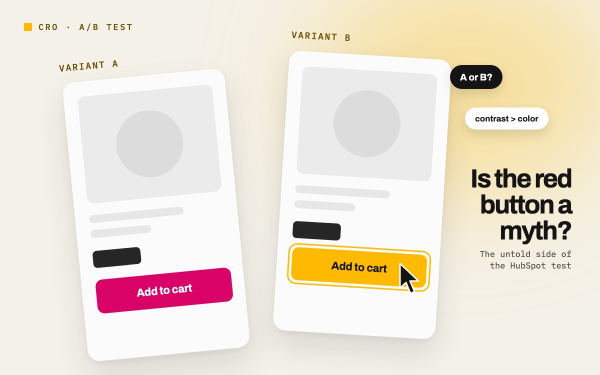
There is a line in digital marketing that everyone has heard somewhere: “You Can Boost Revenue Just by Changing a Button’s Color. Especially to Red…”
The claim has been repeated so often that it is now treated as a rule. Yet once you dig a little into the test the myth is based on, it turns out the story is not at all what people say it is.
It All Started with a Single Test in 2011
In 2011, HubSpot (then called Performable) ran a simple A/B test on its homepage: green button or red button?
Same copy, same visuals, same layout. The only thing they changed was the color of the button.
The result: the red button got 21% more clicks.
That figure was soon summarized as “red sells” in hundreds of blog posts, presentations and LinkedIn posts. And so the myth was born.
The Detail Nobody Mentions: The Page Was Already Green
People focused only on the result. So they missed a ‘small’ detail, and this is the crux of the matter: the tested page’s main color scheme was green.
In other words, the green button blended into the background and became almost invisible. Red was the only contrasting element on the page, so the eye went straight to it.
The winner was not the color. The winner was contrast.
Had you run the same test on a predominantly red page, the green button would probably have won.
The ironic part: HubSpot itself was the first to say this. The original post clearly stated that green was already part of Performable’s color scheme, that red may have created a nice contrast with that green, and that the results could not be generalised. The myth was not created by the test, but by the people who only read its headline.
Conflicting test results confirm this
If red really had a magic power, later tests run by others would produce consistent results. They don’t:
- Dmix increased conversions by 34% with a red button in a 600-person test, but the dominant color on that site was also green.
- VWO ran a similar test on an e-commerce site; an orange-ish red button made only a 5% difference.
- In different studies, orange, pink, bright green and even white buttons beat red.
The common thread is always the same: the winning button was the one that stood out most from the rest of the page.
What does science say?
On the academic side, there is no finding that supports the idea of “one right color” either:
- Labrecque and Milne (2012) showed that color changes brand perception only when it is consistent with what the brand promises. Color has no magic of its own.
- A large-scale 2020 study with 4,598 people in 30 countries found that the relationship between color and emotion is largely universal, but shaped by language and culture.
In short, color gains meaning not on its own but in context.
So what should you do? A practical roadmap
When choosing a button color, follow these steps instead of looking at color psychology lists:
1. Measure contrast, don’t guess it. Does your button stand out clearly from the background? Under the WCAG accessibility standard, the text on the button should have a contrast ratio of at least 4.5:1, and the button itself should contrast with the background by at least 3:1.
2. Make the CTA color the “least used” color in your palette. If you give the button a color that appears everywhere on the page, the button disappears.
3. Test one variable at a time. If you change both the color and the copy at once, you will never know why the winner won.
4. Don’t decide before you have enough data. The result of a 100-visitor test is a difference that can be explained by chance.
5. Look at bigger levers before color. Button copy, its position on the page and the space around it usually have a much greater impact than color.
There is no “winning color” to copy
The button color myth is a fine example of a single test being taken out of context and turned into a general rule.
A color that wins on someone else’s site may lose on yours, because users don’t see the color, they see how noticeable the button is. That is why you need to focus on context and plan your set-up accordingly.
In your next test, ask this question: “Could someone who looks at this button for 3 seconds find it at first glance?”
If the answer is yes, the name of the color doesn’t really matter.
References
Tests and case studies
- HubSpot (Performable) – The Button Color A/B Test: Red Beats Green — blog.hubspot.com
- CXL – Which Color Converts the Best? (Dmix and VWO test data) — cxl.com
- OptinMonster – Which Is the Best Call to Action Button Color, According to Research? — optinmonster.com
- Adobe – The Impact of Color on Conversion Rates — blog.adobe.com
- EyeQuant – What Is the Best Color to Use for Call-to-Action Buttons? — eyequant.com
- Nordlys – Color psychology and brand perception — nordlys.io
Academic studies
- Labrecque, L. I. & Milne, G. R. (2012). Exciting red and competent blue: the importance of color in marketing. Journal of the Academy of Marketing Science, 40(5), 711–727. doi:10.1007/s11747-010-0245-y
- Jonauskaite, D., Abu-Akel, A., Dael, N. et al. (2020). Universal Patterns in Color-Emotion Associations Are Further Shaped by Linguistic and Geographic Proximity. Psychological Science, 31(10), 1245–1260. doi:10.1177/0956797620948810
Let’s talk about this for your brand.
Write to us →