How can we make the form experience "lightweight" without tiring the user? Here are 15 practical tactics to reduce users' cognitive load and boost form conversion...
A user comes to your site and reaches the form page.
However, a few seconds later, they pause; thinking, “Why does this field exist?”, “Do I have to fill it all out?”... And they close the page.
Sound familiar?
Form abandonment rates are often not due to user disinterest, but because the process feels unnecessarily complex or tedious.
This is exactly where the concept of cognitive load comes into play.
In short, it refers to how much a user has to think, remember, or make decisions to complete a task.
The more this load increases during the form-filling process, the lower the probability of completion.
So, how can we make the form experience easier without wearing out the user?
Here are 15 practical tactics to reduce users' cognitive load and boost form conversion:
1. Clear Purpose, Clear Action
A form should have only one single purpose.
When the user sees the form, the answer to the question “What am I doing here?” should be instantly clear.
Multiple CTAs or redirections cause indecision.
A clear goal and a strong call to action make the decision to fill out the form easier.

2. Remove Unnecessary Fields
Every additional field demands slightly more mental energy from the user.
Therefore, when designing the form, question whether each field is truly necessary.
Removing information unrelated to the purpose gives the user the feeling of “I can finish this,” directly impacting completion rates.
3. Group Fields, Show Progress
Long forms can be daunting.
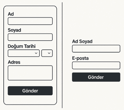
Dividing fields into logical groups (such as “Personal Information”, “Contact”, “Payment”) makes the process more understandable.
Step-by-step progress indicators prevent the question, “How much longer is left?” and give the user a sense of control.
4. Make Labels Visible
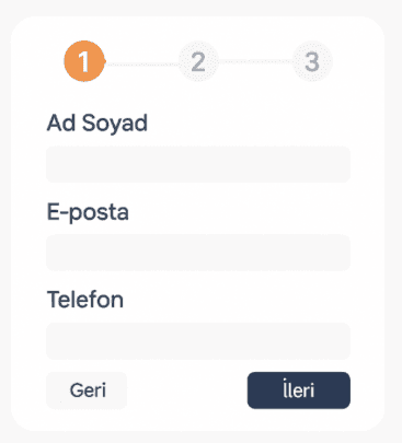
Showing field names only as placeholders causes the guide to disappear once the user starts typing.
Visible, simple, and user-friendly labels increase readability and reduce errors.

5. Provide Instant Feedback
The user should notice their error while typing, not after submitting the form.
Instant feedback both prevents errors and guides the user without causing frustration.
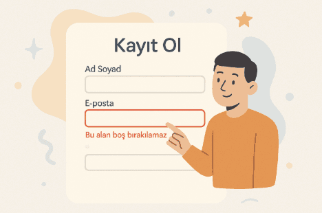
Simple and descriptive messages (such as “This field cannot be left blank”) support the user correctly.
6. Empathize with Errors
Nobody wants to be scolded for making a mistake.
Instead of cold and technical error messages, use short and friendly language.
Saying “Please enter a valid email address.” instead of “Invalid information” both guides and creates a sense of trust.

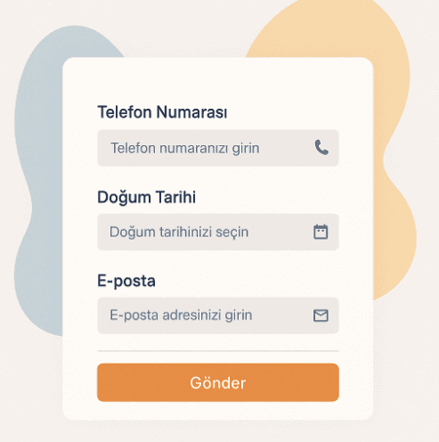
7. Select the Correct Input Types
Optimize form fields based on the expected type of information.
Micro-improvements, such as a numeric keyboard for the phone number field and a calendar picker for the date field, make the process intuitive and reduce errors.
8. Support Auto-fill
Auto-fill features offered by browsers dramatically shorten the form completion time.
Supporting this feature in fields like email, address, or card information saves time for the user and makes the process “effortless.”
9. Use Smart Defaults
Automatically filling in predictable information, such as the user's country, language, or date, is a small but effective convenience.
However, these defaults must always be editable; control must always remain with the user.
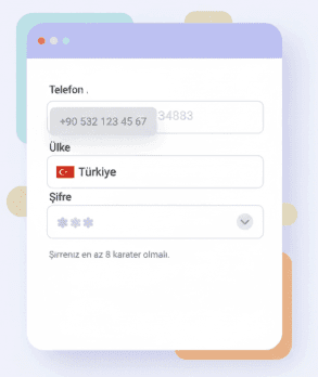
10. Explain with Micro-copy
Short informative notes are silent helpers that guide the user correctly.
Phrases like “Your password must be at least 8 characters” or “Enter your phone number starting without a zero” remove ambiguity and reduce cognitive load.
11. Don't Forget Accessibility
A good form should be usable by everyone.
Labels compatible with screen readers, sufficient color contrast, and keyboard navigation are the cornerstones of an accessible experience.
This is not only a technical requirement but also a demonstration of an inclusive approach.

12. Strengthen the Feeling of Trust and Privacy
Users want to feel safe when sharing personal information. A short privacy note next to the form (“Your information will only be used for communication purposes”) increases trust.
Visual elements like an SSL badge or a link to the privacy policy support this perception.

13. Prioritize the Mobile Experience
Most forms are now filled out on mobile.
Easy-to-tap areas on small screens, a stable page layout, and fast loading times are the basics of the mobile experience.
Instead of squeezing a desktop form into a mobile screen, it must be designed specifically for mobile.
14. Offer Flexibility in Long Forms
Some forms are naturally long.
In these cases, dividing the form into steps or offering a “Continue as guest” option draws the user into the process.
Giving the user the opportunity to start immediately reduces abandonment rates.
15. Continuous Improvement
Form optimization is not a one-time task. It is necessary to analyze where users get stuck, observe on which steps they hesitate, and conduct tests accordingly.
This continuous improvement culture is the most powerful way to keep increasing conversion rates sustainably.

Filling out a form should not be a chore for the user; it should be an experience.
It should not require guesswork, overthinking, or trying a second time.
Remember: the purpose of a form is not just to collect data, but to build a relationship.
Forms that guide, reassure, and do not fatigue the user determine the quality of the first contact with your brand.
And that contact is the exact moment conversion begins.